Posts

Marketing automation for senior living

Marketing Automation for Senior Living: Real Results

We spend a lot of time on the blog and with our clients discussing the value of marketing automation for senior living. But the proof is in the results. Below, we’re highlighting what two years’ worth of sound marketing strategy and automation achieved for Sinceri Senior Living, which is based out of Vancouver, Washington, and has over 70 communities across the U.S.

But first, let’s have a quick refresher on marketing automation.

Why does marketing automation for senior living matter?

Marketing automation enables you to send the right message to the right person at the right time. As its name suggests, everything happens automatically in the background. A website visitor’s actions enable marketing automation to glean the visitor’s intent and give them a lead score. The score helps determine the next steps.

For example, if someone downloads a guide about retirement planning and indicates they want to move to an independent living community within a couple of years, they would receive a different score than someone who requests a tour next week because their mom needs memory care ASAP.

The former would be considered a marketing-qualified lead (MQL). They’ve indicated intent and interest, but they’re not ready to buy now or any time soon. They’ll enter lead nurturing workflows designed to keep them engaged.

The latter is a sales-qualified lead (SQL). They’ve indicated sales readiness through their actions and the info provided through the tour request.

The marketing automation can keep track of everyone—who they are, their lead score, and what should happen next. The automation also frees up the marketing and sales team from mundane, repetitive processes—and the automation can quickly scale to accommodate multiple communities.

So, instead of keeping track of who’s who and when to send emails, the marketing team can focus on developing engaging content that attracts more qualified traffic to the website—think blog posts, videos, and social media content. Meanwhile, the sales team can focus on high-intent leads instead of wasting time working “all leads,” which has traditionally been the approach in senior living.

OK, so all of this might sound well and good in theory. But how does marketing automation work in practice? Is everything as seamless as we described above? And what about the results?

Below, we’re sharing two years’ worth of results for Sinceri Senior Living: August 2021 to August 2022, and August 2022 to August 2023. Sinceri is a prime example of how automation can enhance marketing efforts, streamline processes, and, most importantly, drive tangible results.

Year one: Building a solid foundation

Sinceri Marketing Numbers

The stories behind the numbers

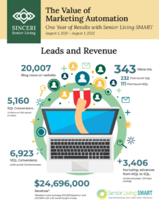
Sinceri’s blog enjoyed an impressive 20,007 views, a crucial indicator of increasing online engagement. The real success, however, was evident in the conversion rates. The MQLs stood at 6,923, a significant portion of which (3,694) came from guide downloads and 3,229 from brochure downloads.

The SQLs were even more telling of the strategy’s effectiveness, with 5,160 conversions comprising 3,229 tours and 1,931 requests to speak with sales representatives. This successful nurturing of MQLs to SQLs was marked by 3,406 advancements, a testament to the effective combination of email nurturing and lead scoring.

The move-ins may be the most compelling evidence of the automation strategy’s success. Out of 343 total move-ins, 232 were attributed to first-touch SQLs and 111 to first-touch MQLs, translating into a remarkable $24,696,000 in revenue, considering the average resident lifetime value.

Year two: Refining strategy and focusing on quality


The stories behind the numbers

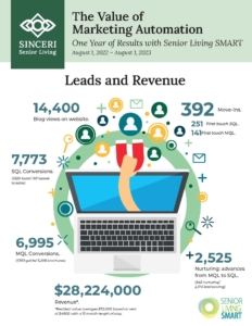
The second year (August 2022 to August 2023) showed an interesting trend. Although blog views decreased to 14,400, this wasn’t necessarily a setback. In fact, it highlighted a more targeted and quality-driven approach to traffic acquisition. The MQLs slightly increased to 6,995, indicating more efficient conversions despite lower traffic. The brochure downloads significantly rose to 5,206, showing a shift in user preference and content effectiveness.

The SQLs saw a notable increase to 7,773, underscoring the efficiency of the nurturing process. The number of move-ins also rose to 392, with a higher proportion of first-touch SQLs (251) than first-touch MQLs (141). This translated into a staggering $28,224,000 in revenue, further cementing the effectiveness of marketing automation in driving real financial outcomes.

The value of marketing automation for senior living operators

The above results demonstrate the value of marketing automation for senior living communities. The results include:

  • Enhanced engagement: Automation tools help the right leads receive the right messages at the right time, boosting engagement and conversions to the next steps.
  • Improved conversion rates: The transition from MQLs to SQLs and then to actual move-ins highlights how automation streamlines the lead nurturing process and positively impacts conversions.
  • Increased revenue: The substantial rise in revenue over two years highlights the direct financial benefits of adopting a well-strategized marketing automation system.

Sinceri Senior Living’s experience with marketing automation offers invaluable insights for other senior living communities. It demonstrates that with the correct setup and strategy, marketing automation isn’t simply a tool for efficiency; it’s a pathway to meaningful engagement, better conversions, and significant revenue growth.

Want to turbocharge your community’s marketing? Let’s talk!

We can help you implement marketing automation so that it delivers the ROI you crave. Get in touch and let’s talk about marketing automation.

Senior couple sitting on sofa reviewing a websiteon computer

Senior Living Website Design: Does Yours Build Trust?

Your senior living website is your most important marketing asset, one that must build trust with prospects no matter where they are in their journey.

What’s the number one reason most people mistrust a website? Poor site design.

Luckily, your senior living website design is something within your control. A good design does cost money, but it’s a worthy investment.

Here’s the secret sauce to a senior living website that builds trust:

  • Designed with the user in mind: Think simple navigation, highly intuitive feel, and accessible.
  • Worthwhile content: Think engaging stories through words, visuals, and overall design and layout.
  • Technically sound: Think mobile-friendly, fast, and secure.

Below, we take a deeper dive into each bullet point.

Senior living websites that build trust are designed with the user in mind.

Think accessible.

You want to create a senior living website that’s aesthetically pleasing and accessible. Making a website accessible isn’t simply the right thing to do. For some businesses, it’s also required.

Private businesses and nonprofits with 15 or more employees are subject to the website compliance guidelines defined by the Americans with Disabilities Act (ADA). This act likely covers most—if not all—senior living communities.

At a minimum, you must consider things like . . .

  • Font size and color contrasts (e.g., can people distinguish what’s a link vs. regular text?)
  • Whether all photos have appropriate alt text
  • Whether the site is easy to navigate with adaptive technologies (like screen readers)

And that’s just the beginning.

Learn how we help our clients make accessible websites with UserWay.

Think custom.

We always urge our clients to avoid stock images. We can’t tell you how often we see the same images of older adults across different community websites.

You’ll have difficulty differentiating your site if you’re using the same canned images. Someone might even think they’re on your site because they recognize an image when, in reality, they’re on a competitor’s site that uses the same photos. Custom photography allows you to differentiate, enhance your brand, and better tell your community’s story.

You’ll also want to avoid website templates for various reasons, but the main one is it’s hard to create a custom experience from a template. (Here’s a longer list of why you should avoid templated websites.)

Think fresh.

Websites can grow stale and stagnant, especially in the senior living space. You’ll want to refresh your senior living website every two to three years (or even redesign it).

Senior living websites that build trust offer worthwhile content.

Content and design go hand-in-hand. You could have the best content in the world, but a poorly designed site will cause people to bounce before they fully experience it. On the flip side, a beautiful site will be nothing more than an empty shell if the content doesn’t pass muster.

So, let’s talk about content. The content on your senior living website should provide facts and connect with your audience’s emotions. The best way to accomplish the latter is through storytelling. Stories can attract, engage, and persuade your audience by showing them through words and visuals how your community can solve their problems and improve their lives.

To create compelling stories, you should follow some best practices. Use real photos and videos, a clear and conversational tone, emotional words and sensory details, and a simple, logical structure.

You can also use storytelling techniques to craft riveting narratives that resonate with your audience. Examples include the hero’s journey, the before-and-after, or the problem-solution.

With storytelling, you can create great content for your senior living website that sets it apart from the competition and helps convert anonymous traffic into tours.

Senior living websites that build trust are technically sound.

Your senior living website design must also consider technical aspects in addition to the overall look and feel. If you have one without the other, you won’t be able to deliver a great user experience.

Stuck on how to evaluate your site from a technical perspective? Begin by asking the following questions:

How speedy is your site?

Site speed is a crucial factor for user experience and SEO. A slow-loading site can frustrate your visitors and make them bounce. It can also affect your Google ranking, especially on mobile devices.

According to Think with Google, the probability of bounce increases by 32% as page load time goes from one second to three seconds. Get in the habit of checking your site speed and performance regularly. Optimize it by using tools like Google’s PageSpeed Insights or GTmetrix.

Here are some other ways to improve site speed:

  • Compressing and resizing your images
  • Minifying and combining your CSS and JavaScript files
  • Enabling caching and GZIP compression
  • Using a content delivery network (CDN)
  • Removing unnecessary plugins or scripts

How does your site render across mobile devices?

You must optimize your senior living website for mobile devices. A mobile-friendly site is important to Google and to prospects, many of whom will be viewing your site on something other than a desktop.

Note: An independent website audit will give you and your team an overview of what’s working and what’s not, especially from a technical standpoint, including how well the site renders across mobile devices.

How’s your site’s security and privacy?

Site security and privacy are essential for building trust and credibility with visitors, residents, and their families. A secure site can protect your data and users’ data from hackers, malware, and phishing.

Some of the ways to improve your site security and privacy are:

Some items are invisible to site visitors or aren’t front and center (for example, privacy policies are usually linked in the footer). Although subtle, all are essential trust signals. Consider the privacy policy. When someone wants to read your privacy policy, your site will build trust when it’s super easy to find it.

We can help you develop a senior living website design that builds trust.

Your website is your community’s online hub. You can’t successfully compete if it’s not in top shape. Let us help. Start with our Total Online Presence Audit. Or get in touch and let’s chat about your website’s specific needs.

Senior living website design

Senior Living Website Design Best Practices

We recently talked about how to create great copy for your senior living website. (Hint: It involves tapping into emotions.) But now let’s discuss senior living website design best practices.

Think of your website design as a supporting actor, not the lead.

People aren’t coming to your community’s website to see the design. They go to your site to learn about your community, to see if it stirs something inside of them, and to find answers to specific questions.

So again, think supporting actor, not the lead.

Don’t get us wrong, however. We’re not trying to diminish the design’s importance. The supporting actor in a film is still significant. And the same is true for the design of your senior living website.

The website’s design must . . .

  • Guide the prospect where to go next
  • Make it super obvious where everything is
  • Be accessible to all people and across all devices

So how can you accomplish these things?

Keep reading.

Use real photos, not stock images.

Setting up professional photo shoots can be a pain in the butt—and a pricy one at that. We get it. But here’s the thing: While we do think a professional photoshoot is a worthwhile investment, especially for your senior living website design’s “foundational” images (like banner images on core pages), there’s nothing that says you can’t use photography from your staff’s smartphones to round out your efforts.

Yeah, yeah—blasphemy, right? Any designer reading this is likely cringing. But the reality is that today’s smartphones are capable of taking fabulous pictures, including ones that can work great on websites. (Remember, you don’t need the same high-resolution that you would for print materials.)

So if you truly want to elevate your community’s website, consider doing this: invest in staff training. Teach your marketing, sales, and activities teams how to take fabulous pics with their phones (a skill they can use and benefit from in real life, too).

Set up a team Dropbox that everyone has access to on their phone as well. Teach people how to take pics, do simple edits (like removing something from the background, getting rid of red eye, brightening a shot, etc.), and upload to Dropbox.

Then, your web designer should review everything regularly and keep the website updated with fresh shots. (Of course, marketing teams should also be paying attention to what’s in the Dropbox for social media, blog posts, downloads, etc.)

And remember to make this training part of the regular onboarding of anyone in marketing, sales, or activities.

A great place to start is with this guide from HubSpot: Phone Photography 101: How to Take Good Pictures With Your Mobile Device.

Bottom line: Thanks to today’s highly-advanced smartphones, there are ZERO reasons why any senior living website should still be using stock photography.

  • PRO TIP: You might have heard rumors that Google penalizes sites for using stock images. This is false. As Search Engine Land notes in its interview with two Googlers, “Stock photography will not have a negative influence on web search performance for a webpage . . .” But that doesn’t mean using stock images is a smart strategy, especially for senior living communities, as we explained above.

Spend more time on your home page. (And don’t be afraid of experimenting with it.)

Your home page is arguably the most important page on your website. Even if people don’t enter your site via the home page, chances are good that they will navigate to it at some point.

The biggest challenge with the home page is that it needs to talk to everyone—and also one person specifically.

What do we mean by that? Well, your home page needs to speak to people who are at various points in their journeys.

Some folks might simply be learning about senior living. Others might be in a more urgent situation where they need to make a move within 30 to 60 days. Some might be looking on behalf of others (for example, an adult child looking on behalf of her mother). Prospective employees will land on the page as well. Some people will be visiting your home page for the first time while others will have visited a handful of times already.

Being all things to everybody—and yet still speaking to a specific person about their specific needs—is a balancing act, for sure.

One way for senior living communities to accomplish this is by helping site visitors immediately self-identify where they need to go next.

Create clearly labeled paths for people to follow. Good visuals can make all the difference. Maybe you include four nicely designed boxes in different colors right below the header image that speaks directly to your target personas:

  • I’m learning about senior living options.
  • I’m looking on behalf of a loved one.
  • I’m interested in booking a tour.
  • I’m interested in joining your team.

We’re riffing here, but you get the idea. Someone reading those options can self-identify and have a good sense of the information they’ll find when they click on the box that describes their situation.

Other important home page tips for senior living community websites:

  • Use clear navigation. Don’t be coy or cute.
  • If you use drop-downs, go big. Andy Crestodina from Orbit Media notes, “Little dropdowns create visual friction without much payback for the visitor. Big dropdowns (better known as mega menus) still have that bit of friction, but they offer so many options the UX benefits outweigh the cost.”
  • Use real images of real people. See above. We can’t stress this point enough. And/or use real videos of real people.

Make your senior living website design accessible—to everyone.

This might mean overriding complaints from your web designer, depending on their personality. (Plenty of web designers do understand what we’re about to say, though.).

For example, if your designer feels a bigger font looks out of place with their design, but you know the bigger font is better for site visitors, well guess what? Go with the bigger font. If that means the designer needs to adjust their design to accommodate it, so be it.

Always err on the side of accessibility vs. aesthetics. (Honestly, an accessible site can still look amazing.)

Making a website accessible is the right thing to do. And, in many cases, it’s also the legal thing to do. Private businesses and nonprofits with 15 or more employees are subject to ADA website compliance guidelines. (That likely includes most—if not all—senior living communities.)

ADA stands for Americans with Disabilities Act. As marketing guru Neil Patel explains, ADA compliance is a process, not an overnight “fix.”

Things you need to think about:

  • Font size and color contrasts (e.g., can people distinguish what’s a link vs. regular text?)
  • Whether all photos have appropriate alt text
  • Whether the site is easy to navigate with adaptive technologies (like screen readers)

And this is just the beginning.

Keep in mind that improving your website’s accessibility will help your target demo of older adults. For example, those bigger fonts and strong contrasts in colors will work well with aging eyes.

Learn more about the product we use to help our clients’ sites remain compliant and accessible to all.

Work with an agency that can help elevate your senior living website design.

At SLS, we appreciate a senior living website that’s accessible, aesthetically pleasing, and one hundred percent on brand. And more importantly, we know how to design sites that accomplish all three. Get in touch and let’s talk about how we can elevate your community’s website.

Further reading:

How to Boost Website Conversions

Senior Living Website Design: Tips to Boost Conversions

Senior living website design involves so much more than fonts, colors, images, and layout. Sure, those things are important. But if your site only looks pretty, but doesn’t convert anonymous website traffic into leads, what’s the point? 

Bottom line: Your design strategy must go hand-in-hand with your overall marketing strategy. Follow these tips to accomplish exactly that. 

Design your site for multiple buyer journey “pathways.”

Remember, the buyer controls the sales process, not the other way around. In fact, buyers often interact with content anywhere from 8-10 times (if not more) before showing any interest in talking to sales.

As a result, your senior living website design needs to enable the buyer to take the next logical step in their specific journey. On the home page, provide clear paths. If they self-identify as an older adult researching senior living communities for a move within the next year, provide a logical path through the site. The same is true for an adult child looking on behalf of a parent.

By providing paths that reflect each buyer’s journey, you’ll increase conversions along the way. How so? Well, the various conversion points will happen in a way that makes sense to that particular buyer. 

For example, for the adult child, you’d offer content downloads that make sense to them, such as “A Guide to Helping Loved Ones Make the Move to Senior Living.” On the flip side, for an older adult evaluating different communities, you might offer content like: “What to Expect in Your First Month Living in Our Community.”

On any given page, make it clear what people should do next.

Your senior living website serves as your virtual storefront. Brick-and-mortar retail stores are designed to lead people deeper and deeper into the store so that they stay in-store longer. (The same is true with grocery stores—that’s why the meat and deli departments are in the back of the store.) 

Your senior living website design needs to do the same thing: You need to entice people to stay and explore your site. Here are some strategies for keeping people invested:

  • Use sticky menus. Navigation that remains at the top even as people scroll can be an excellent way to keep people oriented as to where they are—and to stop them from backing out in frustration.
  • Use well-designed and thoughtfully placed CTAs. The CTAs should lead people to valuable content that will help them on their journey. Read more about the power of CTAs in senior living marketing.
  • Use video. Video tends to increase the time spent on a page. Studies suggest that including video on landing pages can increase conversions by as much as 80%. But like anything else, you need to be thoughtful in how you use video—where it’s placed, how it integrates with the page, how quickly it loads, and so forth. 

Be mindful of how your senior living website design renders across all devices.

Creating a consistent experience is key to consistent conversions. If the desktop experience is fine, but the experience on a phone leaves a lot to be desired, you might lose the person to a competitor simply due to that frustrating experience. 

When we say a “consistent” experience, we don’t simply mean making sure the site looks exactly the same across all devices. The experience on smartphones should be different from the experience a person has on a desktop since they are two very different devices. What you want to avoid is having someone experience a disconnect from one device to another—the branding should be consistent, as should the pathways people follow. But how you optimize your site for mobile will and should be different.

For example, you might need to adjust CTA designs so that they’re super easy to read on mobile. Your font and text size on mobile might need to be different from the desktop experience. You get the idea. (Need more tips? Read HubSpot’s article on how to optimize websites for mobile users.)

Now, if you’re thinking smartphones aren’t as popular with your key demos, think again. Sure, the Silent Generation (born 1925 to 1945) might not be married to them. But the demo right behind them—Baby Boomers—most certainly are (and so are their kids). In fact, according to this report from HigherVisibilty, “In the first quarter of 2021, 54.8% of web searches were done via mobile devices (excluding tablets).” And guess what? That number is only going to go up.

Practice good technical SEO.

When we talk about search engine optimization (SEO), we’re usually discussing it in relation to the copy on the page. But technical SEO is just as important. And that’s specifically something the web team needs to shoulder.

What is technical SEO? Backlinko has a good definition: “Technical SEO is the process of ensuring that a website meets the technical requirements of modern search engines with the goal of improved organic rankings. Important elements of Technical SEO include crawling, indexing, rendering, and website architecture.” 

Run A/B testing with various elements of your senior living website design.

If you want to boost conversions, run A/B tests of various design elements to see which ones give you the biggest increase. Simple things—from font size to text color—can greatly impact conversions. 

SEO guru Neil Patel lists 19 obvious A/B tests to conduct on your website. His recommendations include:

  • Typography
  • Colors
  • Font size
  • CTA design and placement
  • Landing page styles (long copy vs. short copy – layout plays a critical role)

Don’t treat your senior living website as a static thing.

This is especially true after launching a new site—or relaunching an existing site. It’s easy to think the heavy lifting is over and that you can just sit back. While this might have been OK a decade ago, it’s not the case today. Monitor analytics (especially on high-priority landing pages), conduct A/B testing, and adjust things, as needed. 

Experiment with interactive elements within your senior living website design.

Building off the above point, be willing to try different things, from live chat to pop-ups. The challenge is seamlessly working these elements into your senior living website design so that they feel natural rather than intrusive. (And the look-and-feel needs to reflect the brand.)

Need help rocking your senior living website design?

Let’s boost conversions on your senior living website. Either opt for our budget-friendly website audit. Or we can chat about a custom strategy. Either way, get in touch!

Senior Living Web Design

Senior Living Website Design: Does Yours Need a Refresh?

As we approach the end of the year, now’s a good time to take stock and plan for 2022. So here’s a question to ponder: Does your senior living website design need a refresh?

To help you decide, ask yourself the following questions:

Is the site older than five years? 

Unfortunately, it doesn’t take long for senior living website designs to look dated. (This is true for any design.) While there’s no rule saying that you must redesign, you should take a hard look at the site if it’s older than five years. 

If the site is still delivering solid results, you could leave it alone or simply do some cosmetic refreshes here and there. If you go this route, however, you might want to start thinking about a redesign in a year or so—and start planning (and budgeting) for it now.

Was the site professionally designed with search in mind?

Plenty of web designers care primarily about making things look pretty. And while your site’s look-and-feel is important, what’s the point in having an attractive site if it doesn’t come up in organic searches?

Does the site render well across all devices?

And when we say all devices, we mean all: desktops, laptops, tablets, and phones (all of which have various screen sizes). If you’re not sure, run some tests. Look at the site on different devices. Does the site remain easy to navigate and read (a must, especially for your target audience)? 

If the answer is no, seriously consider a redesign. A good web developer will create a senior living website design that renders properly across all devices. This will keep users happy as well as Google, which is important from a search perspective. Reminder: Google has publicly said, “We’re boosting the ranking of mobile-friendly pages on mobile search results.”

Is your site accessible to everyone?

Have you heard of the Web Content Accessibility Guidelines (WCAG)? Its goal is to provide “a single shared standard for web content accessibility that meets the needs of individuals, organizations, and governments internationally.”

We’ve always advocated making senior living websites accessible to everyone, especially since our target audience is an older demographic, many of whom have aging eyes. Over the years, we’ve taught many clients about the value of adjustable text sizing, strong color contrast with fonts and backgrounds, avoiding layering text over images, and using alt tags to describe images. (Just to name a few best practices.) 

So ask yourself: Is your site accessible to all people? If the answer is no, you need to address this. The solution might not involve a complete gutting of the website. (We can help you with this step, thanks to our collaboration with UserWay, our accessibility compliance partner.)

Is the site delivering results?

Your website serves as your 24/7 sales counselor and as your virtual welcome center. It should absolutely be making you money by attracting the right visitors, turning those visitors into leads, and converting those leads into move-ins

To achieve these results, your site needs to deliver a fabulous experience at every point in the buyer’s journey. Between the analytics and your own gut, you probably already know the answer to this question. If your site isn’t delivering strong ROI, it’s time to revisit what’s going on—and to make plans for a redesign, if necessary.

Still not sure? Maybe it’s time to perform an audit of your online presence.

Remember, your website is the primary hub of your overall online presence, but all those other online hubs—think social media platforms, Google My Business, and directory listings—need to work in concert with the main hub, your senior living website. So if you haven’t performed an audit of your overall online presence in the last couple of years (or ever), then that’s a good first step. 

The audit will automatically answer all of the above questions. You can do the audit yourself. Or you can order a budget-friendly audit from us. We provide a fresh set of eyes and objective assessment—along with a concrete plan for making fixes that your team can run with. Learn more about our Total Online Presence Audit here. And, as always, reach out if you have questions.